
AI agents are great at calling tools, but the default way of showing that work is usually a wall of JSON, a spinner, or a sentence that asks you to blindly trust something happened. I wanted the tool call itself to become a useful interface.
That became Connector UI: a rendering system I designed and built for Writer Agent that takes results from tools such as Gmail, Slack, Google Calendar, Salesforce, and many others, then presents them through a consistent set of interaction and display patterns.
First, let's start with where we were.
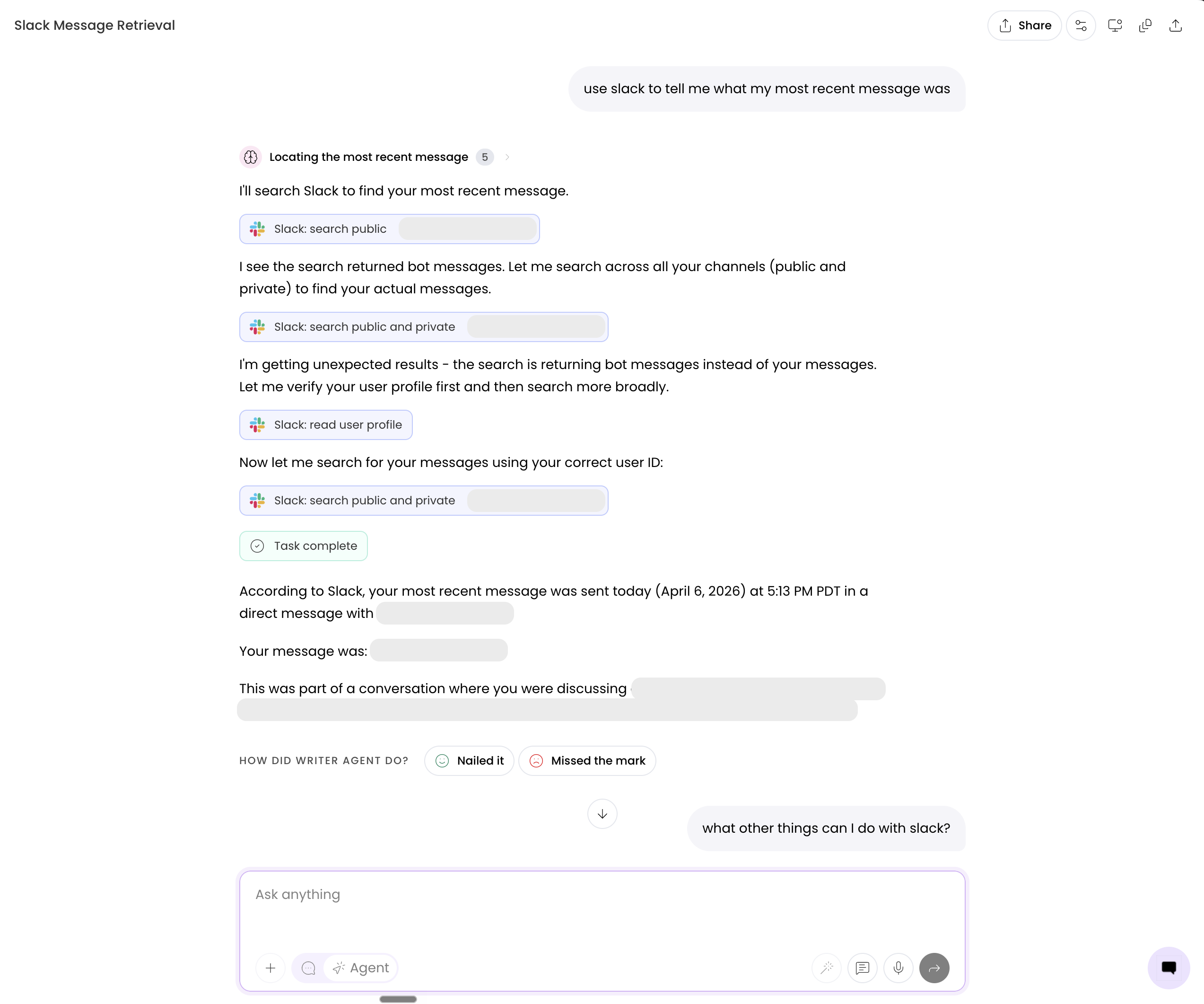
Below is a screenshot of Writer Agent's previous chat interface in which I ask what my latest Slack message was (with internal information greyed out). Each of those Slack tool calls is a button that displays raw JSON. Not ineherently helpful to a user (both techincal and non-technical alike).
States don't really exist for the buttons and the user ultimately relies solely on the agent output for context instead of the tool calls. I wanted to fix that.
The obvious answer to fix and display this information moving forward was a card. The harder questions were what deserved to go inside it, when it should expand, and how it should behave before, during, and after the tool call. The goal was for the same kind of result to look and behave the same way regardless of which connector produced it.
Every connector has its own vocabulary. A calendar returns events, a messaging tool returns a transcript, a CRM returns fields on a record, and an email connector may return plain text, HTML, or a provider-specific object containing either one. Even tools that return almost identical information rarely agree on names, nesting, or formatting.
Here is a deliberately small example: Both results mean “an email”, but they do not give the interface the same thing to work with:
{
  "to": "mark@example.com",
  "subject": "Review the examples",
  "body": "Can you take a look?"
}{
"toRecipients": [{ "emailAddress": { "address": "mark@example.com" } }],
"subject": "Review the examples",
"body": {
"contentType": "html",
"content": "<p>Can you take a look?</p>"
}
}Multiplying that difference across connectors, functions, authentication states, partial responses, errors, and repeated calls made a component-per-tool approach feel wrong almost immediately. I did not want dozens of integrations to become dozens of tiny design systems.
That being said, consistency did not mean erasing those differences. An email should still feel like an email, a calendar should make time visible, and a table should preserve comparison, as you'd expect. What needed to stay consistent was the surrounding grammar: how a tool identifies itself, how much of the result opens, where actions live, how raw output remains available, and how the interface behaves as the call changes state.
What consistency looks like
Those constraints are easier to see than describe. Each fixture below represents one of the six result families Connector UI recognizes.
Switch between the results and look through their content. The body changes to suit the information, while the header, collapse behavior, actions, and raw-output path stay familiar.

The calendar uses a timeline, the email preserves recipients and subject, and the table keeps rows scannable. They do not look identical, but they clearly belong to the same product.
Producing that consistency required separating connector variability from the visual system. Connector output is treated as untrusted and irregular input. The product owns everything after that point: normalization, recognition, template selection, components, motion, accessibility, and fallbacks.
Once that ownership boundary was clear, the architecture became easier to divide: Connector UI would decide what a result meant, and a renderer would turn that decision into native React.
Using JSON Renderer
JSON Renderer gave me a useful solution: a typed JSON spec goes in and Writer-owned React components come out. A catalog limits the component vocabulary and validates the props each component can receive.
It is worth being specific here because “JSON rendering” can make the system sound more magical or model-driven than it is. Connector UI does not ask a model to invent the interface. The recognition and composition path is deterministic code. So, JSON Renderer is the boundary between the spec Writer composes and the React registry Writer controls.
The engine around it is bespoke:
- Unwrapping extracts useful output from several tool-result envelopes.
- Normalization removes incidental nesting and parses JSON-shaped strings.
- A macro recognizer scores the result against six template families.
- A micro recognizer tags individual values as people, timestamps, links, statuses, tag lists, or plain values.
- A composer for each family creates the exact UI spec.
- A typed catalog constrains that spec to known components and props.
- The renderer resolves lifecycle states and mounts the spec inside the Writer Agent harness.
The package renders the tree and Connector UI decides what the tree is allowed to mean. That decision begins by identifying the result without trusting the tool to name it correctly.
Recognizing a result without trusting its name
The recognizer is one of my favorite parts of the system because it makes an unruly problem a lot less messy.
The macro recognizer checks six signatures: email, calendar, message, data table, document, and record. Shape is the strongest signal that these have to go off. Function and connector names are hints used to break ties or promote an ambiguous result, not permission to force a template that otherwise wouldn't fit.
The scoring functions are intentionally boring, but boring is good here:
function scoreEmail(payload: unknown): Score | null {
  if (!isObject(payload)) return null;

  if (has(payload, "to", "subject", "body")) {
    return {
      confidence: 0.9,
      reasons: ["recipient, subject, and body fields"],
    };
  }

  if (
    typeof payload.subject === "string" &&
    isOutlookBody(payload.body) &&
    isOutlookRecipientArray(payload.toRecipients)
  ) {
    return {
      confidence: 0.92,
      reasons: ["Outlook recipients, subject, and body fields"],
    };
  }

  return null;
}
Calendar looks for start and end fields. Messages look for a sender plus content, or a known transcript format. Tables look for uniform arrays of records. Documents look for transcript structures or long-form content. Records catch recognizable entities without stealing low-detail write acknowledgements that would be better left collapsed.
Each scorer returns a confidence and the reasons for it. The recognizer runs them all and keeps the strongest eligible match:
const scorers = [
  [Template.Email, scoreEmail],
  [Template.Calendar, scoreCalendar],
  [Template.Message, scoreMessage],
  [Template.DataTable, scoreDataTable],
  [Template.Document, scoreDocument],
  [Template.Record, scoreRecord],
];

for (const [template, score] of scorers) {
  const baseline = score(preparedPayload, context);
  const hint = boostForFunctionAndConnector(template, context);
  const confidence = Math.min(baseline + hint, 1);

  if (confidence >= minimumFor(template) && confidence > best.confidence) {
    best = { template, confidence, normalizedPayload: preparedPayload };
  }
}
There are two thresholds on purpose. The recognizer has a low bar for finding a plausible candidate. The rendering pipeline has a higher bar (0.7) for showing a rich template expanded in the conversation. In reality, those are different questions: “what is this most likely to be?” and “am I confident enough to present it as that thing?”
Then the micro recognizer handles meaning inside the selected template. A boolean can become a status and an ISO date can become a timestamp. An object with a name and avatar can become a person and a URL can become a link. This keeps provider-specific field names out of the component layer without handing the renderer the freedom to improvise.
Once the system has a template family and meaning for its important values, the next step is mroe mechanical: compose an interface from known parts.
Composing the interface
A template composer converts normalized content into a flat spec. The email composer, for example, does not return a bespoke <GmailCard /> or <OutlookCard />. It creates the same email vocabulary for both:
const bodyElements = [
  ["email-to", element("EmailToHeader", { recipientNames: to, label: "TO" })],
  ["divider-recipients", divider()],
  [
    "email-subject",
    element("EmailTitleHeader", { title: subject, label: "SUBJECT" }),
  ],
  ["divider-subject", divider()],
  ["body", emailBodyElement(body)],
];

return buildSpec(
  [
    ["header", buildHeader(context)],
    [
      "body-container",
      element(
        "TemplateBodyContainer",
        { variant: "empty" },
        keys(bodyElements),
      ),
    ],
  ],
  bodyElements,
);
The resulting spec can only name components in the catalog, and the props are validated:
const catalog = defineCatalog(schema, {
  components: {
    EmailToHeader: {
      props: z.object({
        label: z.string().optional(),
        recipientNames: z.array(z.string()).optional(),
        recipientAvatar: z.string().optional(),
      }),
    },
    TemplateHeader: {
      props: z.object({
        toolLabel: z.string(),
        connectorDisplayName: z.string(),
        status: z.enum(["failed", "waiting", "skipped"]).optional(),
        stackCount: z.number().optional(),
      }),
    },
  },
});
That constraint is really what gives Connector UI its reliability and consistency. Connectors can vary wildly before the pipeline, but they cannot send arbitrary CSS, invent a seventh header layout, or decide that their error state deserves an entirely different interaction.
That is what allows the six template families to share one interaction model without collapsing into one generic card. The templates solve the shape of a completed result, but the conversation still has to explain how the result got there.
The states are part of the product
A tool result doesn't go from “nothing” to “card” instantly. It has a lifecycle, and the potentially awkward moments are where interactions and states really need to shine.
The renderer models those moments explicitly:
type ConnectorRenderState =
  | { kind: "loading-header"; spec: Spec }
  | { kind: "success-header"; spec: Spec }
  | { kind: "success-template"; result: PipelineResult }
  | { kind: "error-card"; spec: Spec }
  | { kind: "fallback-pill" };
Loading
The loading state is a header, not an unrelated spinner floating near the conversation. It already shows the humanized function and connector identity, then resolves in place when content arrives. Ideally, this makes “Draft email · Gmail” feel like one object completing instead of a loader disappearing and a card being mounted somewhere nearby.
And the skeleton is intentionally light. At this point the system knows which tool is running, but not which result shape it will receive. I didn't make sense to me to pretend to know the final layout and create motion with no informational value.
High-confidence success
At 0.7 or above, the selected template opens with a rich preview. Calendar results show events, message results show the conversation, email results preserve recipients and subject, and generic records use meaningful field treatments from the micro recognizer.
The original tool output remains available from the menu at all times via a popover action. I wanted the designed view to be the default without making it an opaque summary of what the connector actually returned.
The core pipeline is quite small once the surrounding work exists:
const recognition = macroRecognize(effectivePayload, context);

if (!recognition || recognition.confidence < 0.7) {
  return composeCollapsedFallback({ payload: effectivePayload, context });
}

const taggedFields = microRecognize(recognition.normalizedPayload);

return compose(recognition.template, {
  payload: recognition.normalizedPayload,
  taggedFields,
  context,
});
Low-confidence success
Low confidence is still a successful tool call. Connector UI simply refuses to act more certain than it is or display more thab there should be.
The fallback renders the shared header and starts collapsed. The raw result is still one click away (via the popover), but the system does not stretch an unfamiliar payload into the wrong card. To me, this is a much better failure mode than a confident-looking interface with mislabeled information.
It also gives us a clean way to improve the recognizer. A new payload shape can safely ship through the fallback today, gain fixtures and recognition rules tomorrow, and become an expanded template without changing the connector contract.
Waiting for user action and skipped
Some tool calls cannot finish until the user authenticates a connector, confirms an action, or supplies another piece of information. Those calls remain visible with a “Waiting for user response” status while a separate action prompt provides the actual choices.
If the user skips setup, the same header resolves to “Skipped.” I did not want either state to look like an error: nothing broke, and the agent may still be able to continue through another route. Keeping waiting and skipped distinct from failure lets the conversation explain what is blocking progress without turning every interruption red.
The header-only spec is deliberately shared:
function buildHeaderOnlySpec({ status, ...identity }: HeaderOptions): Spec {
  return buildSpec([
    [
      "header",
      element("TemplateHeader", {
        ...identity,
        status,
        standalone: true,
        hideCollapseToggle: true,
      }),
    ],
  ]);
}
Failed
A failed connector call stays compact by default (but for this example they're expanded by default), but the card can expose the complete error, an explanation, copy controls, and the raw JSON output. That balance matters in an enterprise product: most people need a clear description and a next step, while support and technical users still need the exact evidence.
Failure is also a template rather than a one-off red block. It keeps connector identity, action IDs, feedback, and raw-result behavior consistent with successful calls.
Repeated calls
Agents often call the same function several times while gathering an answer. Rendering five nearly identical cards in sequence makes the conversation feel like a log file.
Connector UI coalesces those calls into a stack and adds an xN count to the front card. High-confidence results keep the useful front preview. Low-confidence results become a compact header stack. The stack communicates that repeated work happened without making internal iteration the loudest thing on the page.
It is not intended to be a per-call audit view as the front card is the primary result, but the count and raw tool-call path preserve enough context to understand what the agent did.
Stacking ambiguous results
Shows repeated Gmail calls staying condensed while Connector UI waits for a recognizable result shape.
Stacking recognized results
Shows consecutive Slack calls stacking during loading, then expanding once Connector UI recognizes the result.
Across all of these states, the same rule decides how much of the tool call deserves the reader's attention.
Motion carries state
One important callout is that collapse and expansion are not decoration here. I (like many others) am guilty of introducing animation and motion where I think it looks cool and not always where it's strictly necessary to convey something.
In Connector UI, I made sure that motion was present only where necessary. Motion explains that the result is still present, only condensed. The production component animates height with a spring while shifting and fading the inner content on the way out. It also respects reduced-motion preferences and avoids replaying the entrance when a low-confidence result intentionally starts collapsed.
<motion.div
  initial={false}
  animate={{
    height: isMinimized ? 0 : "auto",
    opacity: isMinimized ? 0 : 1,
    y: isMinimized ? -16 : 0,
  }}
  transition={{
    type: "spring",
    stiffness: 260,
    damping: 32,
    mass: 0.9,
  }}
>
  {content}
</motion.div>
Getting that transition right took more time and care than the final code suggests (). Streaming results can move a card from a condensed tool-call state into a complete template, and the animation has to feel like one object resolving rather than one component disappearing while another pops into its place.
That combination—recognition before rendering, then shared state and motion around the result, is also what separates Connector UI from the frameworks I considered.
Where MCP UI and CopilotKit fit
Connector UI is not the only way to put an interface around a tool call. It is the layer Writer needed because the input could not be trusted to identify its own interface.
MCP Apps, and the MCP UI SDKs that implement the standard, let an MCP server provide an interactive HTML interface that a supporting host renders in a sandboxed iframe. That is a strong fit when the server should own a portable, app-like experience such as a dashboard, form, visualizer, or multi-step workflow. It also means presentation can vary from server to server. Writer could constrain those apps to match, but that constraint would still be Writer's work.
CopilotKit's tool rendering takes a different route: an application can attach custom React UI to its agent's tool calls, including lifecycle status, arguments, and results. That works especially well when tool identity is reliable. Connector UI's generic execution path often knew only that a function ran and received an irregular payload. It still needed normalization, shape recognition, confidence thresholds, lifecycle handling, stacking, and fallbacks before a component could be chosen.
Either approach could produce a somewhat similar result, but in reality, they solve different ownership problems. MCP Apps favors server-owned, portable interfaces. CopilotKit helps an application render known agent actions. Connector UI keeps the interpretation and visual contract inside Writer Agent so similar results remain similar even when the connectors are not.
JSON Renderer then handles the final handoff from that decision to native React. It is the last mile of Connector UI, but not the system making the decision. Basically, I wanted to have control over every single step with the existing harness infrastructure we already had.
To conclude a long article
You really only get a few chances to wow a user when communicating an outcome to them (especially if they've used the product in some capacity before). Why can't there be a moments of delight when working on tasks and projects in what would typically be an afterthought.
Connector UI is sure to evolve and grow as time goes and as feedback rolls in. Feel free to try it out at Writer and let me know what you think!
If you've made it this far, thanks for reading and there's more to come soon.